Learning to See Light Through Pen and Ink
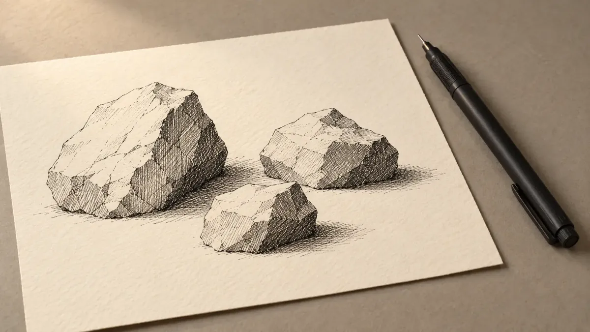
AI-generated illustration; not a reproduction of my own artwork.
If a pen-and-ink sketch looks flat, adding more lines may not help. One of the most useful things I am learning about drawing is to decide where the light comes from before I start shading.
I have been practicing with rocks, cracks, and other simple forms. My early attempts have taught me that detail and depth are not the same thing: marks only help when they describe the shape of an object and the light falling on it. I am still learning, but several practical lessons are becoming clear.
Start with the light, not the pen
In one rock exercise, I imagined the light coming from the upper left. That choice should have guided everything else: which planes stayed light, which turned away from the light, and where the rocks blocked light from reaching one another.
The strongest-looking areas were often the dark contact points between rocks. Those shadows helped separate the forms and gave them weight. Some lines along brighter edges were less convincing. Instead of describing the shape, they risked looking like random texture.
That was a useful correction to my instinct to keep adding marks. More hatching does not necessarily mean more realism. Marks need a reason.
Hatching is a way of describing form
I am beginning to think about hatching as a change in value rather than simply a pattern. Close, dark marks can help anchor a shadow. More open marks can suggest a transition. Sometimes an area should remain mostly untouched so the light can do its work.
The line width matters, too. A heavier fineliner can establish strong darks, while a finer one can make controlled transitions easier. But the tool cannot make the lighting decision for me. If I do not understand which surfaces face the light, changing pens only changes the appearance of the confusion.
I also need to judge the drawing from a distance. If its main light and dark shapes do not read at a glance, tiny details probably will not rescue it.
Five steps I want to repeat
For my next exercises, I want to keep the process straightforward:
- Choose one clear light direction.
- Identify the surfaces facing toward and away from it.
- Mark the darkest contact and cast shadows first.
- Build middle values gradually with deliberate hatching.
- Step back and check whether the object reads as a solid form.
This gives me something specific to evaluate. Instead of asking whether a sketch looks impressive, I can ask whether the lighting stays consistent and the form makes sense.
Learning without chasing another tool
Books such as Arthur L. Guptill's Rendering in Pen and Ink and Scott Robertson and Thomas Bertling's How to Draw are part of the broader learning path I am exploring. I am treating them as learning resources, not as evidence that every observation in my practice is already correct.
There is plenty of equipment I could experiment with: different fineliners, paper, sketchbooks, and portable pens. Some of those choices may eventually make practice more convenient. For now, the higher-value work is learning to see what the light is doing before I decide how to draw it.
A better drawing begins with a better observation.
Reading references
- Guptill, Arthur L. Rendering in Pen and Ink. Publisher book information, Penguin Random House.
- Robertson, Scott, and Thomas Bertling. How to Draw. Publisher book information, Design Studio Press.